Identity systems
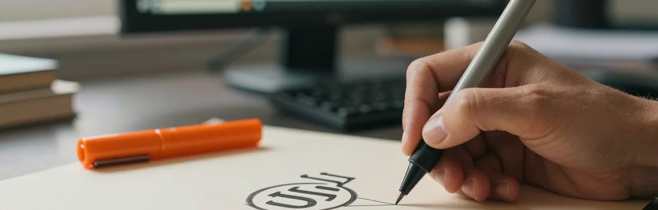
A mark, a wordmark, and the rules that keep them working when you are not in the room — sizes, clearspace, the versions for dark and light, and what not to do with any of it.
PartsIllustrator · Affinity · type specimen
Services Brand & Video
An identity is not a picture you like; it is a set of shapes that has to survive a bag stamp, a shopfront, an invoice, a favicon and somebody else's PowerPoint. A film is not a showreel; it is two minutes that have to hold on a trade-stand screen in daylight and on a phone held at arm's length. Both get made for those conditions — and the mark on this page was drawn in 2013, which is a reasonable test of whether it was right the first time.
PartsIllustrator · Affinity · DaVinci Resolve · Premiere Pro · Logic · image models
§01 What gets made
Identity and film look like different trades and are the same discipline underneath: decide what the thing actually is, then make every decision survive the place it will be seen.
A mark, a wordmark, and the rules that keep them working when you are not in the room — sizes, clearspace, the versions for dark and light, and what not to do with any of it.
PartsIllustrator · Affinity · type specimen
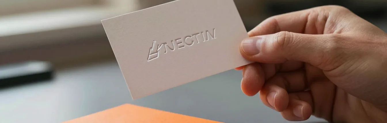
Cards, stationery, signage and packaging, specified for the way ink actually behaves rather than the way a screen renders it. Letterpress, foil and flat stock are three different jobs.
PartsAffinity · letterpress · print specs
Brand films, documentary pieces and social cuts — one shoot, then as many edits as the job needs: a long version, a feed version, and a nine-second story that still makes sense with the sound off.
PartsDaVinci Resolve · Premiere Pro · Logic
Phone footage, old DSLR material and archive tape brought back to a clean, consistent image. The most useful thing this studio does for organisations with a decade of footage and no budget for a reshoot.
PartsDaVinci Resolve · noise · grain · matching
§02 How the work goes
The same five whether we are drawing a mark or cutting a film. The one that most studios leave until the end — proving the thing works in the place it will actually live — happens here in the middle, while changing it is still cheap.
01 · Listen
Before anything is drawn: what the business does, who already trusts it, and which of the words in the brief describe it rather than the wish.
Most weak identities come from designing the aspiration instead of the thing. A café that roasts its own beans is a roastery with tables; that is a different mark from a café that buys in. This stage ends with a paragraph you agree with — the plainest possible description of what you are — and the list of places the identity has to survive: a bag stamp, a shopfront, an invoice, a favicon, the end frame of a film.
For film it is the same question in a different shape: what has to be true for a viewer by the end, and what they will do next. A fundraising film and a trade film both raise money and are not the same object.
02 · Draft
Drawn rather than generated, in black and white first, and cut down hard before you ever see them.
Black and white first, because a mark that only works in colour does not work: it will be embroidered, stamped, faxed, engraved and printed one-colour by somebody you will never meet. Curves are built deliberately — the mark on this site is two shapes and one cubic Bézier, and its coordinates are written down, which is why it could be redrawn thirteen years later without redrawing it.
You see three or four directions, not thirty. A wall of options is a way of transferring the decision to the client; choosing is the job you are paying for. Each one comes with the reason it exists and the case against it.
03 · Test
The chosen direction gets printed small, blown up large, and looked at in the conditions it will live in — before sign-off, not after.
A mark drawn at poster size on a bright screen and approved at poster size on a bright screen is an untested mark. So it gets shrunk to stamp size, reversed out of a dark ground, put on a photograph, printed on the actual paper where the budget allows, and viewed at the distance a shopfront is read from. One café identity was signed off only after it had been checked at both a bag stamp and a shopfront, which is why it still worked when one shop became three.
Film gets the same treatment: the cut is watched on the two screens it will actually be seen on — a stand screen in daylight and a phone — because a grade made in a dark room and viewed in a bright one is a different film.
04 · Finish
A logo is not a brand. The deliverable is the whole set of decisions, written so other people can follow them.
Type is paired so it does not compete — one face for the wordmark, one for display, and a reason for both. Colour is specified twice over: a value for display type and fills, and a separate, darker value for small text and links, because the brand colour that sings at forty-eight point can fail a contrast check at fourteen. Where a brand lives on both a dark ground and a light one, both are specified together rather than one being derived later in a hurry.
On the film side this is the grade: recovering a neutral image first — a phone hands you baked-in sharpening, crushed shadows, narrow latitude and skin tones it already decided on — and only then making creative choices. Sound is mixed for a phone speaker as well as headphones, and subtitles are treated as part of the film when the funders and the people on screen do not share a language.
05 · Hand over
Everything in the formats each supplier asks for, plus the short document that stops it drifting, plus clear ownership.
A sign maker wants vector artwork, a printer wants ink values and a bleed, a web developer wants SVG and hex, a feed wants a square crop and a nine-by-sixteen. Handing over one PDF and wishing everybody luck is how an identity is quietly re-drawn by four different people in its first year.
So the handover is the working files as well as the exports, a short rules document including the things not to do, and a plain statement of what you own. You own it — artwork, project files, footage. Licensed fonts are the one exception, and the licence is named so you know exactly what you are holding.
§03 The toolkit
Tools do not make the work good, but the wrong one makes certain work impossible. Here is what is used and the job it does.
| Part | Why it is there |
|---|---|
| Illustrator | Where marks are drawn. Vector geometry that can be stated in numbers rather than dragged into place, so a curve can be reproduced exactly years later by somebody else. |
| Affinity | Layout and print production — cards, stationery, packaging — with proper colour separation and bleed. Owned outright rather than rented, which matters when a client comes back in year five. |
| DaVinci Resolve | The film industry's colour suite, and the reason a rescue grade is possible at all: node-based grading, real noise reduction, and the tools to match shots that were never meant to sit beside each other. |
| Premiere Pro | Editing, where a job arrives in it or has to leave in it. The cut is decided by the material, not by the software. |
| Logic | Sound: levels, music, and the mix checked on a phone speaker as well as headphones, because that is where most of the audience is. |
| Image models | Concept and illustration, to roughly eighty per cent. The last twenty is a person with a pen, and the gap is visible from across a room. Never used to draw a mark. |
| Type licensing | Faces chosen partly on whether their licence lets you actually use them — on a site, in an app, embedded in a PDF sent to a printer. A beautiful face you cannot licence is not an option. |
| Print specs | Ink values, stock, bleed and finish written down per piece. Letterpress, foil and flat stock behave differently, and the artwork is prepared per process rather than once. |
| Subtitles & dubs | Subtitling as standard where the audience and the funders do not share a language; full dubbing through a local pipeline when it is wanted, at no cost per minute. |
| ffmpeg | Delivery: the renditions for each screen, encoded once and correctly, so a phone is not made to download a cinema master. |
NoteDrawn, not stock. Every icon and diagram on this site was made here, which is the same standard applied to client work.
§04 Where it will be seen
The cheapest film you will ever commission is the second one made from a day you already paid for. Three questions decide how that day is used:
The same logic runs through identity work. A mark that will mostly be seen at sixteen pixels in a browser tab is a different drawing from one that will mostly be seen on the side of a building, and pretending otherwise is how a logo ends up as an orange smudge on a phone.
§05 Not a sales page
Six ways identity and film projects fail. Every one of them is cheap to avoid at the start and expensive to fix at the end.
§06 Straight answers
Less often than you would think. One fundraising film on this site was shot 4K on an iPhone 13, because that was the camera on the hillside that day, and nothing on screen announces it. What a phone costs you is latitude — the image arrives already sharpened and noise-reduced, with crushed shadows and skin tones it decided on for you — so the recovery work before the grade takes longer than the grade itself. The camera sets the ceiling; the grade decides whether you reach it.
Yes, and a good deal of the film work here is exactly that. Phone footage, old DSLR material with a heavily compressed 8-bit codec that bands in skies and smears in shadow, archive tape — brought back to a clean, consistent image and cut into something that holds. It is called a rescue grade because that is what it is.
For illustration and concept work, yes — the current generation of image tools gets a piece to roughly eighty per cent, and the last twenty is a person with a pen. You can see the difference from across a room. For a mark, no: an identity has to be drawn deliberately, with its curves under control and its reasons written down, because it will be redrawn at a hundred sizes by people who were not there.
The mark as vector artwork in the formats each supplier asks for, the wordmark and its type specimen, colour values for screen and for ink, clearspace and minimum sizes, the versions for dark and light backgrounds, and a short written set of rules — including what not to do. Enough that a sign maker, a printer and a web developer can all work from it without calling you.
As long as it earns, which is usually shorter than the brief says. A minute of farm footage cut to a single line of copy did its job; a two-minute fundraising film that stays with one household did its job. The more useful question is how many cuts you need from one shoot — a long edit, a feed version and a nine-second story are three different films made from the same day.
Yes. Subtitles are ordinary work, and where a full dub is wanted there is a pipeline here that separates the voice from the music, transcribes with timestamps, translates line by line and speaks it in a cloned voice — checked by a person reading both languages side by side. It runs locally, so the cost per minute is zero rather than the three dollars a minute we were quoted for it.
You do, including the working files — the layered artwork and the project, not only a folder of exports, so the next person can open it. Licensed fonts are the one exception anybody can have: those come from their foundry, and the licence is named so you know exactly what you hold.
Or a logo that stopped fitting somewhere around the second location. Describe it plainly and you will get an honest answer about what is worth rescuing and what is worth redrawing.
Leave a note See the film work See the brand work
Alsoweb & app design · AI integration · the dubbing pipeline